- Get link
- X
- Other Apps
The 10 most inspirational graphic design trends for 2019
Design helps us understand our world, and trends place us in time. The overarching design trend for 2019? Just like in every other part of life, we seem to be in opposition with ourselves: this year is all about contradictions. Design trends from conflicting eras and opposing ends of the visual spectrum are all vying for attention.
Whether you’re a designer or are working with one, you need to stay on top of the latest graphic design trends. No matter the medium, understanding how styles are changing and evolving keeps your work fresh and resonate with clients. Take a look at our top picks for this year and start imagining how these trends can help inform your style.
10 graphic design trends that will be huge in 2019
—
- 3D design and typography
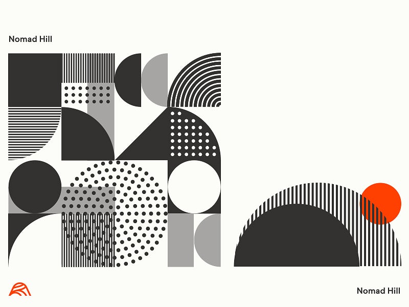
- Asymmetrical layouts
- Art Deco
- Modern Mid-Century Modern
- The evolution of duotones and gradients
- Warm and moody color palettes for photos
- Light and delicate custom illustrations
- Buxom serifs
- Open compositions
- Isometric design
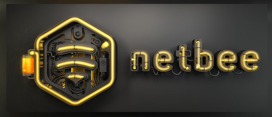
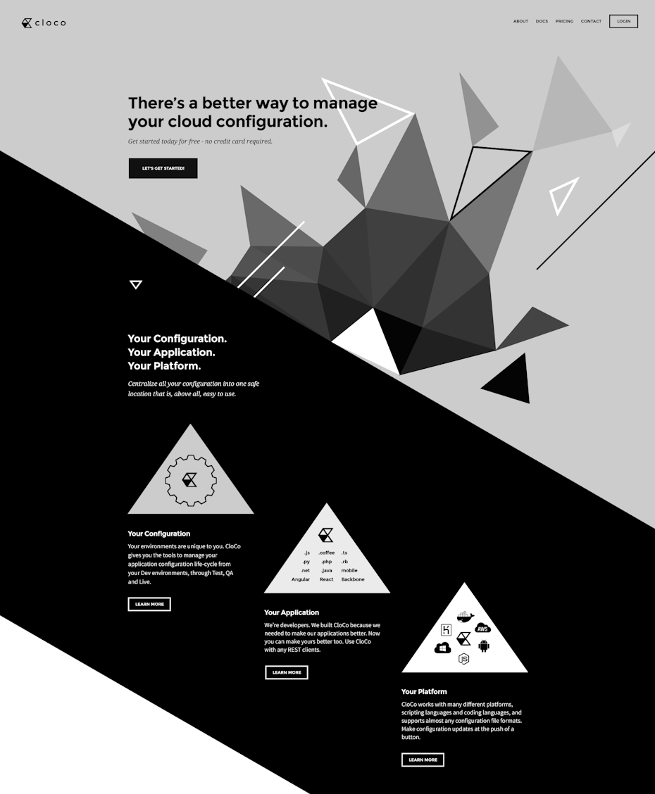
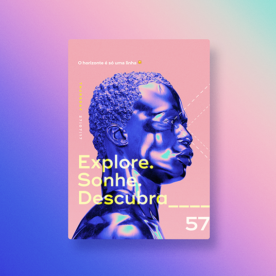
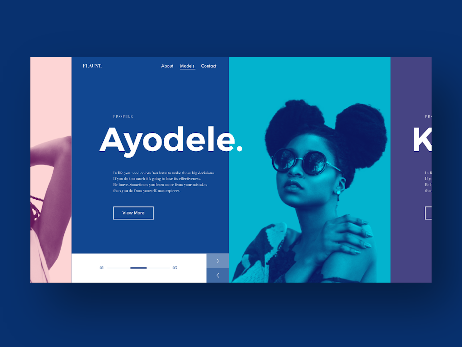
1. 3D design and typography
Three dimensional works seems to be everywhere right now: entire compositions that have so much depth, you can’t help but reach out and touch them. 3D typography especially feels just about ready to pop. The best part about it is there’s no particular type that works best for this trend: bold, skinny, sans-serif, script, any font can be rendered in 3D.
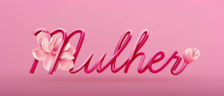
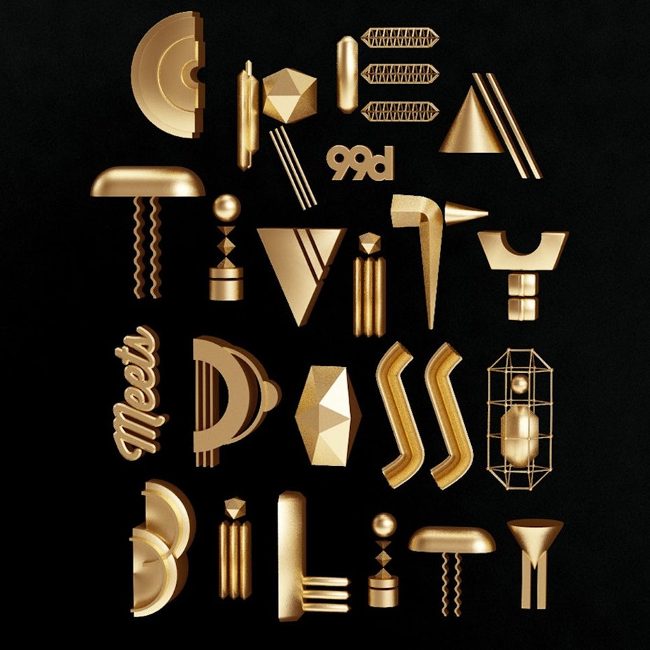
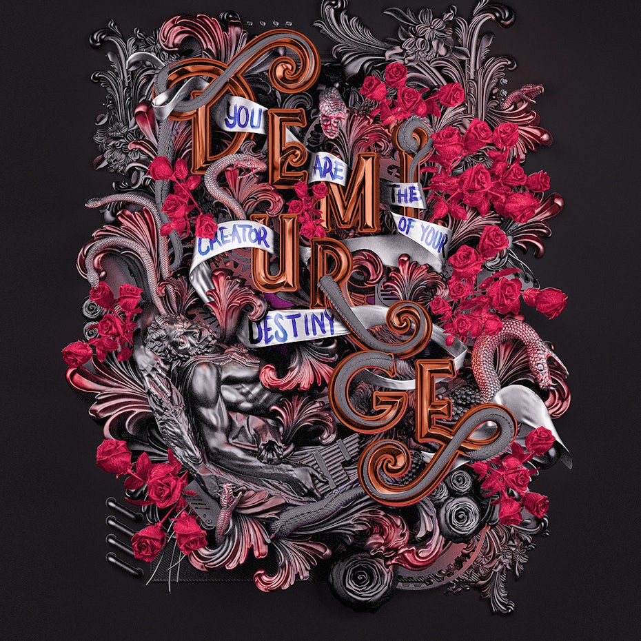
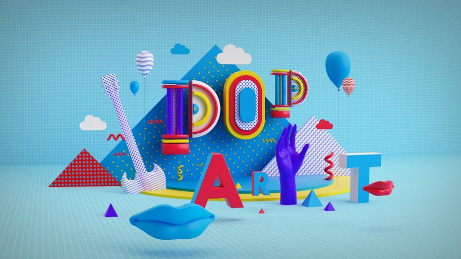
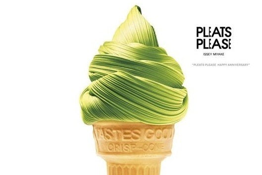
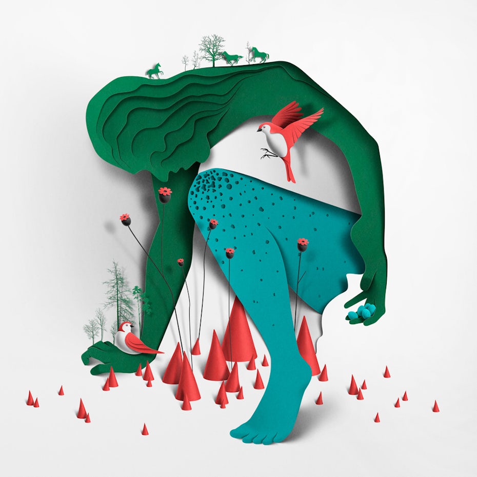
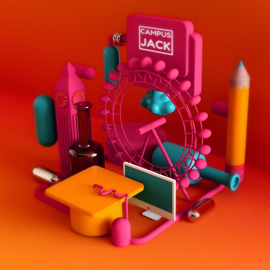
Beyond typography, we’re seeing a lot of gorgeously rendered 3D compositions that give the impression of being still-lives from distant planets. Some designs, like Pinch Studio’s vibrant pop art or Issey Miyake’s marriage of textiles and food, merge these two design trends into futuristic landscapes of color, type and form. Others, like the stunning papercut illustrations by Eiko Ojala, seem like they were created from elements directly from the natural world. In both directions, the effect is stunning—these compositions literally jump right off the page and make it impossible to look away.

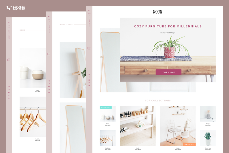
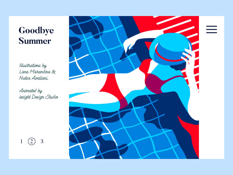
2. Asymmetrical layouts
We’re starting to see the beginnings of a move away from the rigid grid-based designs that have been standard for the past few years. The dominance of Squarespace and Canva and other template-based design sites provided beginners with beautiful websites and graphic products, even if they had no idea what a grid was. Now designers are looking to create products that feel more bespoke and alive.
Enter the asymmetrical design trend.
Because these layouts break free from the rigid and predictable grid, they deliver more kinetic energy and movement. An asymmetrical layout, whether on a design composition, in an app or on a site, demands attention. The user feels an innate curiosity about where the information and graphics might go next, creating a feeling of wonder and interest as they scroll or peruse a design.

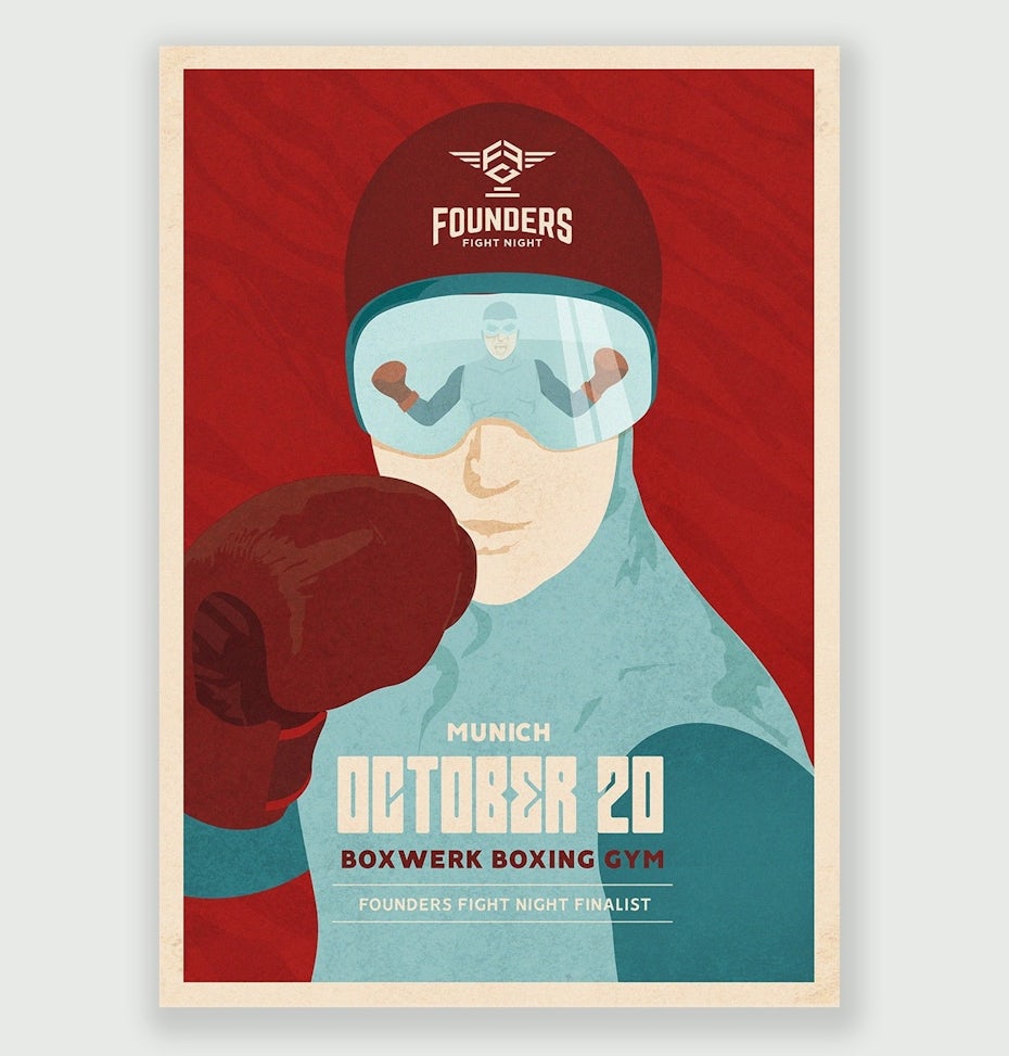
3. Art Deco
The “modern” design era gets its name from the artistic movement of modernism that began after World War I and continued for nearly a half-century. There are two major styles from this period that are currently experiencing a total renaissance: the highly ornamental and glamorous Art Deco designs of the 1920s and the streamlined organic forms of the Mid-Century Modern period of the 1950s and 60s.
Chalk it up to the nearing centennial of the roaring twenties, but Art Deco-inspired designs are set to blow up in 2019. We’re seeing the trend emerge particularly in logo work. Designers are embracing the complex line-work intense symmetry of the era’s best work, while combining it with sharp metallics that would make Jay Gatsby feel right at home. We’re noticing this influence in typography as well, as sans-serifs get narrower and leggier, like they were pulled from a classic A.M. Cassandre poster design. These designs feel opulent and luxurious—and starkly in contrast to the rustic, country-inspired work that has dominated for the past few years.


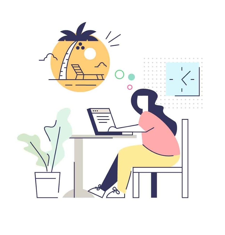
4. Modern Mid-Century Modern
After the Art Deco period—and in direct response to it—designers decided that function should dictate form, ditching the flashy designs and embracing stripped down and organic clean lines. While mid-century influence has been prominently visible in areas like interior design and fashion for the past few years, it’s been a steadily growing trend in graphic work.
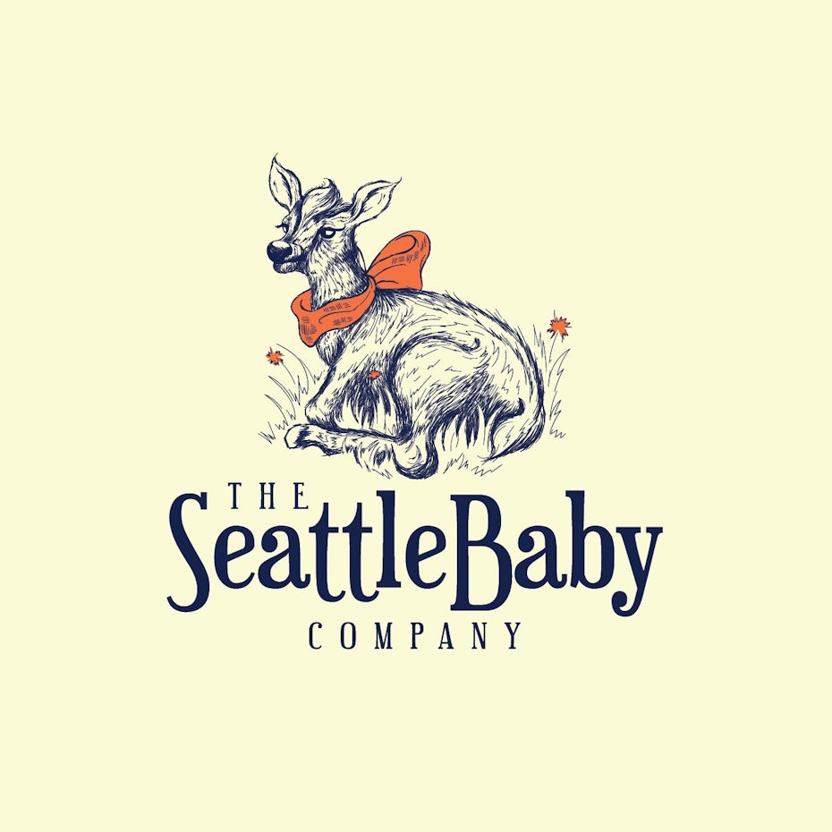
It’s especially prominent in the illustration styles that harken back to the iconic advertising illustrations of the post-War era. And like in that era, small companies and start-ups are recognizing the power of custom illustration work. We’re seeing a lot of brands launching with gorgeous websites, full of these mid-century influenced illustrations, often rendered in a clearly modern style but retaining dreamy vintage color palettes. In 2019 we expect to see these continue to dominate web and in print work as well.


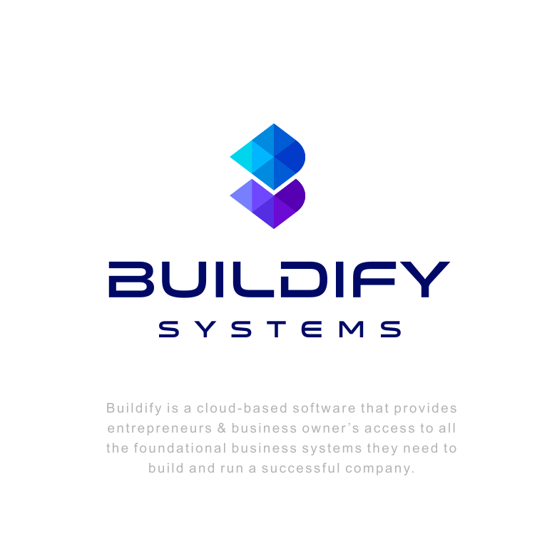
5. The continuing evolution of duotones and gradients
Gradients—“color transitions,” as they are now sometimes called—have been a well-recognized trend for the past few years. Recently they’ve definitely begun to creep back into logo design more heavily. Simple one-color logos aren’t enough; more and more are showing up with some kind of gradient. Some are the expected combinations (blue/purple, red/orange) but others use chunkier duotone fades.
There was much noise made in the past year or two about the “return of the duotone”. Now, often contributed entirely to Spotify and their iconic playlist covers, the two parallel trends have combined, making 2019 the year of the duotone gradient.

6. But also a steady rise for warm and moody color palettes for photos
But of course for every action there is an equal reaction: the prevalence of saturated and bold duotones has led to a rise in moody, vintage tones. While a few years ago designers were told to shun muted colors to embrace the bold and neon—inspired by shows like Stranger Things—the photo colors of 2019 feel more like the days when cameras and screens were not able to capture deeply saturated colors.
They feel like a direct throwback to the soft, low-fi photography of the seventies and even muted camcorder footage of the 1980s. Incorporating some amount of black into each color, these photos have a warm and wistful vibe that neon colors will never compete with.


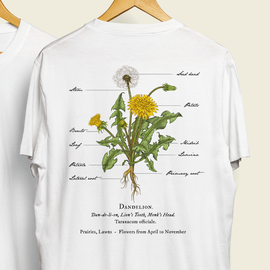
7. Custom illustrations lighten up
After years of bold, thick lines in illustration, there’s been a recent rise in more delicate, elegant illustration. Heavily influenced by botanical and natural elements, this trend is more feminine and appeals to a more innocent and childlike part of us all. We’re seeing it take a front seat particularly in packaging design, where intricate designs are rendered beautifully against a textured paper background. With addition of premium materials like foil and embossing, these designs strike a balance between maximalism and simplicity.


8. Buxom serifs
While the illustrations are getting lighter, the fonts are beefing up—especially when it comes to serifs. While sans-serifs aren’t going anywhere—especially in digital—2019 will be the year of the serif. The past year has given us some gorgeous plump serifs that seem pulled from the days of cast-metal type. While sans-serifs and hand-drawn fonts will continue to be highly visible, this is the year where the range and diversity of serif fonts will explode.
Custom type is becoming more and more necessary for brands that really want to stand out and increasingly a signature serif type or logomark is what designers are turning to. Why? Because after years of dominance the clean sans serif is now seen as “soulless” and “characterless” and serifs are the horned-rimmed glasses of type–seen as quirky cute, smart, and bursting with personality.
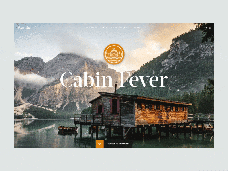

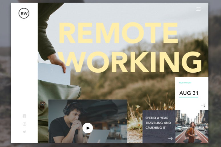
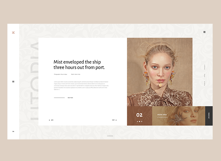
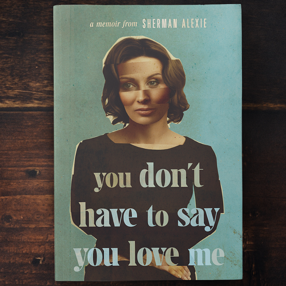
9. Open compositions
Remember that old adage about leaving something to the imagination? After years of boxes and frames encasing elements in a strict order, every single part visible and accounted for, designers are starting to embrace more open compositions. These are designs where you feel like you only see a part of the whole picture and there’s an entire world off the page.
These compositions embrace white space and eschew clear hierarchy. The elements in these compositions feel loosely tethered to each other, as if they could float away. Often open-styled, seemingly chaotic, broken and cut-up, these compositions take a very strong design hand since the placement of each element is anything but random.


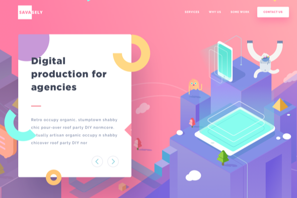
10. Isometric design
While open compositions leave some things out, isometric designs create whole universes in tiny little spaces. Isometric design sounds highly technical, but it’s simply a method of drawing a 3D object in two dimensions. The drawing is simple and clean, but has a depth that flat design can’t compete with. The arena where this trend is heating up the most is with icons. Isometric icons have a lot more tactility and warmth than flat design, drawing users in. Plus they are saved to a smaller file size than 3D, so you get all of the bang with none of the lag!


Are you ready for design in 2019?
—
We’re embarking on what is sure to be a deeply interesting year for graphic design. There’s a push and pull happening between the forward-looking, tech-conscious designers exploring in newer areas like 3D and AR, and the traditionalists still putting pen to paper each day. We also see this in the simultaneous embrace of vibrant duotones co-existing with toned down, vintage palettes. Same goes for whimsical illustration and mid-century functionality.
The best part? Exciting things happen when designers embrace conflict, allowing room for inspiration to strike from every direction at once. We celebrate and look forward to seeing what incredible work they create. Make 2019 the year you create your best work!
Want a deeper look at the best graphic design trends of 2019?
Do you need gorgeous graphic design?
Let our brilliant designer community create something unique for you.

Current design contests
Designers, check out these contests so you can start building your career.
- Create a Label for a Product Extension - Mira Mixed PicklesProduct packaging | $449
- Eagle Jaguar Warriors Deliver The WorldWeb page design | $960
- Website for Football Investment GroupLogo & hosted website | $2,051
- Dark Podcast Cover Art That Appeals to WomenPoster | $199
- Unique abstract and playful logo for Waterbear CloudLogo design | $918
- Jeep Wrap for Autism Center Roadtrip across USCar, truck or van wrap | $899
- Logos, websites & more!
- Music distribution platform brandingLogo & brand identity pack | $2,564
- Thriving Salon Studio looking for a modern logo during rebrandingLogo design | $299
- Brand identity for boutique web development studioLogo & brand identity pack | $699
- Design a youthful themed logo for Furry owned: Zesty Cheese LoftLogo design | $499
- Modern logo and thumbnails for new bicycle fit studioLogo & social media pack | $399
- Start up Real Estate Company needs Logo!!Logo & social media pack | $399
- Classic logo needed for 126 year old historic bar located in a mountain...Logo design | $499
- Logo for Eyelashes and Beauty online storeLogo & social media pack | $405
- Cool Sticker for Cyber Security Start-Up EquipmentSticker | $411
- SEVA - You Are the JourneyLogo design | $499
- The Wandering Goat - design a wood branding iron!Logo design | $499
- Canadian Based Company Holiday CardCard or invitation | $599
- Be the designer behind the brand logo for the internet's new home for...Logo design | $1,299
- Coaching and Consulting Logo to appeal to professionalsLogo & social media pack | $409
- Bad ass one of a kind Competition bbq team logoLogo design | $299
- Diseña un logotipo para tienda multimarca de porteros de fútbolLogo design | $498
- Need a dramatic, web design overhaul for our AI & data science...Web page design | $1,216
- Fresh new software review website needs a design genius!Logo & social media pack | $1,299
The Creative Edge
99designs
Design services
Get a design
Support
Resources
- Get link
- X
- Other Apps


Comments
Post a Comment